A
Unknown brand, real doubt
Yuchai is a major manufacturer, but its name is new in Canada. Buyers worry about parts, service and resale before they look at price.
Yuchai Prairie · Canada
From technical specifications to confident equipment decisions. A product-discovery and sales experience for construction equipment buyers in Canada.
UX/UI Design · Research · Information Architecture · Product Strategy · Interaction Design · Prototyping
01 / Overview
More than a dealership website. A path from discovery to quote.
Yuchai Prairie brings Yuchai excavators, electric machines and attachments to contractors, landscapers, farms and industrial operators across Canada's Prairie region.
The task was to turn a complex catalogue of machines, specifications, attachments and after-sales services into an experience that helps buyers understand the equipment, evaluate fit and move toward a quote with confidence.
02 / The challenge
Construction equipment is not an impulse purchase. Buyers check machine size, working range, performance, attachments, service and jobsite fit before they contact a dealer.
The experience had to work on two levels: simple enough to scan quickly, detailed enough to support a serious equipment decision.
Yuchai is a major manufacturer, but its name is new in Canada. Buyers worry about parts, service and resale before they look at price.
Manufacturer documentation holds dozens of parameters per machine. Shown as one table, the decision-critical numbers get lost.
Parts and service decide the purchase, yet most sites put them in the footer. The strongest local argument is missing from the first screen.
03 / Competitive audit
I reviewed global manufacturer sites, regional multi-brand dealers and equipment marketplaces against the questions buyers ask before they make contact, then set the target for Yuchai Prairie.
| Criteria | Global OEM sites | Regional dealers | Marketplaces | Yuchai Prairie |
|---|---|---|---|---|
| Clear machine classes by weight | ||||
| Key specs visible without a PDF | ||||
| Imperial and metric side by side | ||||
| Parts and service on the homepage | ||||
| Local contact and region named | ||||
| Quote request in two steps or less | ||||
| English and French | ||||
| Distinct visual identity |
Great product storytelling. No local stock, no named region, no one to call in Saskatoon.
Templates built for many brands. Specs in PDFs, weak hierarchy, promotions over information.
OEM-level clarity and craft, combined with dealer-level support and a direct path to a quote.
04 / Research insights
I analyzed how established brands such as Bobcat, Takeuchi and Caterpillar structure product discovery, communicate machine fit and expose technical specifications. A pattern repeats: a few decision-critical numbers and an application story first, engineering data deeper in the journey.
| Research observation | UX implication | Yuchai Prairie response |
|---|---|---|
| Equipment decisions start with fit, not with full specs | Surface a few critical numbers first | Key-spec bar on the U10 page |
| Tight access is a major value driver for mini excavators | Translate dimensions into jobsite meaning | "Compact where access matters" |
| Professional buyers still need the technical depth | Use progressive disclosure | Performance, dimensions, lifting data |
| Attachments multiply what one machine can do | Make attachments part of product discovery | Dedicated attachment story |
| Confidence depends on support after the purchase | The dealer promise can't stop at the machine | Parts, service and local support across the homepage |
Strong product storytelling and clear model hierarchy. Little about the local dealer, stock or who to call.
Multi-brand templates, specs often in PDFs, promotions ahead of information.
Manufacturer-level clarity combined with dealer-level support and a direct path to a quote.
05 / Buyer personas
Three buyer types came out of the research. They share the same fear: a machine that stands idle because a part or a technician is too far away.
"I need to know it fits through the gate and digs deep enough. Then I need parts in days, not weeks."
"One machine has to do trenching, augering and cleanup. Attachments decide if it pays off."
"I buy a machine once and keep it for fifteen years. I want to know who I call when it breaks."
06 / Jobs to be done
Each job became a requirement for a specific part of the site.
AnswerKey stats bar on every model page: weight, dig depth, bucket force, min. width.
AnswerTrust strip and "Support after the sale" on the homepage, not in the footer.
AnswerAttachments section with use cases, plus AUX1 flow and compatibility on the model page.
AnswerQuote form with intent chips: equipment, attachments, parts, service.
07 / Customer journey
The emotional low sits in the Validate stage, where doubt about an unfamiliar brand is highest. That is where the design had to work hardest.
08 / The core UX insight
The core principle became progressive technical disclosure. Instead of showing every specification at once, the experience answers questions in the order a buyer asks them.
09 / Design principles
Research findings turned into principles the team could use to settle design decisions.
Technical drawings, precise labels and real numbers carry the brand. No discount banners, no stock-photo clichés.
FromGeneric dealer look reads as "budget".
The four numbers buyers check first sit above the fold on every model. Imperial and metric, one tap apart.
FromSpecs hidden in PDFs and mixed units.
Parts, service and the local team appear on the homepage, before the buyer has to ask.
FromDoubt peaks at the Validate stage.
Yellow is reserved for the primary action. Every view offers one obvious way forward, with no pressure.
FromBuyers avoid pushy sales flows.
10 / Information architecture
Equipment is organized by operating weight, the way contractors already think about machine classes. Aftercare sits in the main navigation.
11 / Primary user flow
One primary flow. Each step reduces cognitive load, and marketing information gradually gives way to technical information as purchase intent increases.
Purchase intent grows along the flow
12 / Visual concept
The visual language grew from the product itself: thin machine outlines, reference markers and engineering annotations. The interface behaves like an engineering document being drawn in real time.
13 / Colour and type
Graphite and warm off-white carry the page. The accent is Yuchai yellow, the colour of the machines themselves, and it is used only for actions and technical lines.
Approximate share of the homepage surface. Yellow stays under 5%. Secondary headline tones meet WCAG AA for large text: 5.2 : 1 on graphite, 3.8 : 1 on off-white.
14 / UI system
The UI balances two modes: expressive marketing moments and dense technical data. Large editorial type builds confidence; small uppercase metadata, hairline dividers and restrained yellow form the engineering layer.
Primary yellow appears once per view. Arrows move 4 px on hover.
Equipment, parts, service, Canadian access. Same stroke weight as the line drawings.
Canada works in both. The toggle switches every spec on the page at once.
15 / Motion
A motion language derived from engineering drawings. Technical illustrations draw themselves from an empty state and guide attention through complex machinery. The same principle runs through the hero machine, the assembly and the bucket, so they read as one system.
Every stroke carries an order index, so the drawing builds the way the part is assembled: frame first, fasteners last.
Duration scales with the square root of path length. Long lines don't crawl and short details don't flash.
Paths start before the previous one finishes, so the drawing flows like a single hand. Easing cubic-bezier(.33,0,.67,1).
After each stroke completes, the dash pattern is removed, so closed shapes like wheels and the logo ring have no visible seam.
Interaction principles
Machine drawings are the strongest motion on the page. Supporting UI moves less: a fade-up on scroll, a 4 px arrow shift.
The cursor ring grows over links and buttons, and buttons get a light sweep on hover.
Specs, tables and numbers never animate. Values you compare stay where you left them.
The custom cursor appears only on precise pointers. Touch devices keep native behavior.
The first thing a visitor sees. The machine builds from the tracks up to the boom, in eight overlapping groups.
An electrical assembly drawing with callouts. It supports the message that every part is documented and available.
Bucket body, cutters, teeth sheaths and fasteners assemble in order. It introduces the idea that one machine can take many tools.
16 / Homepage strategy
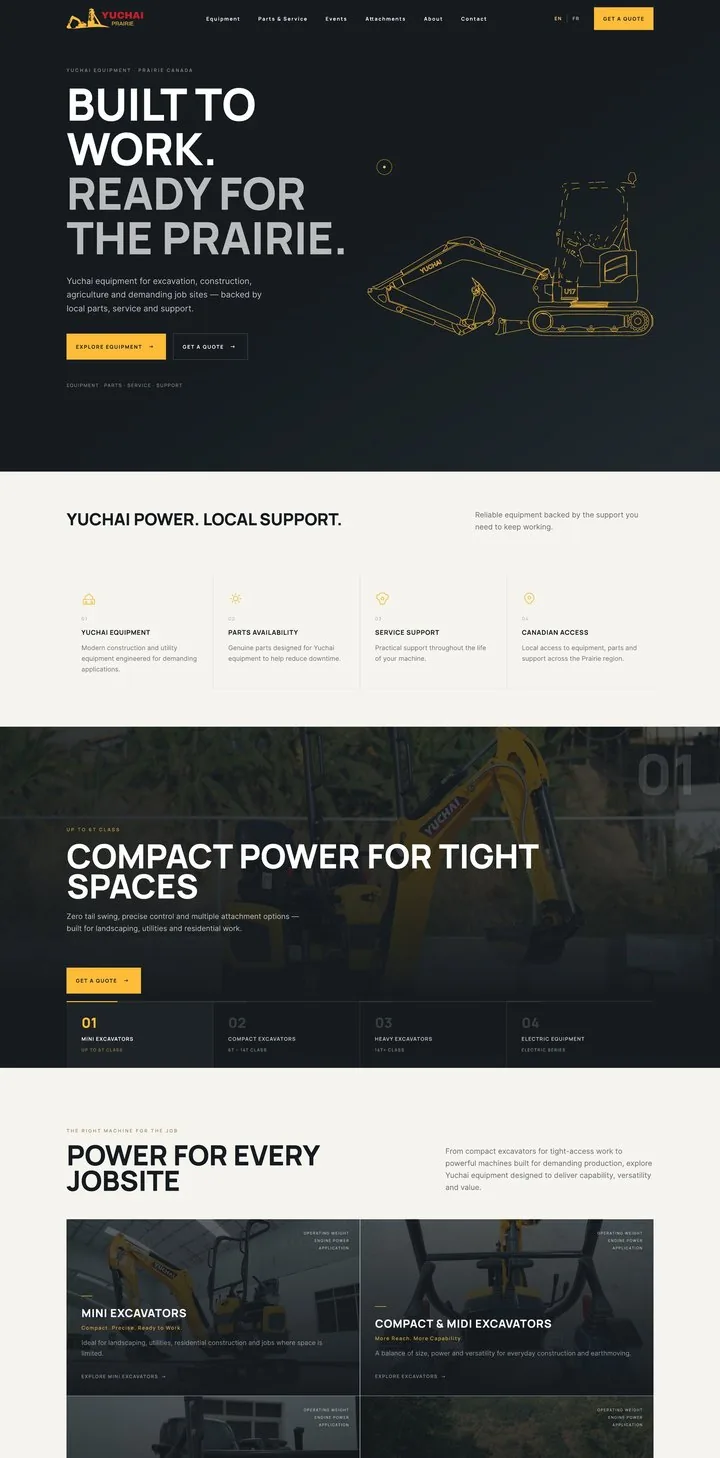
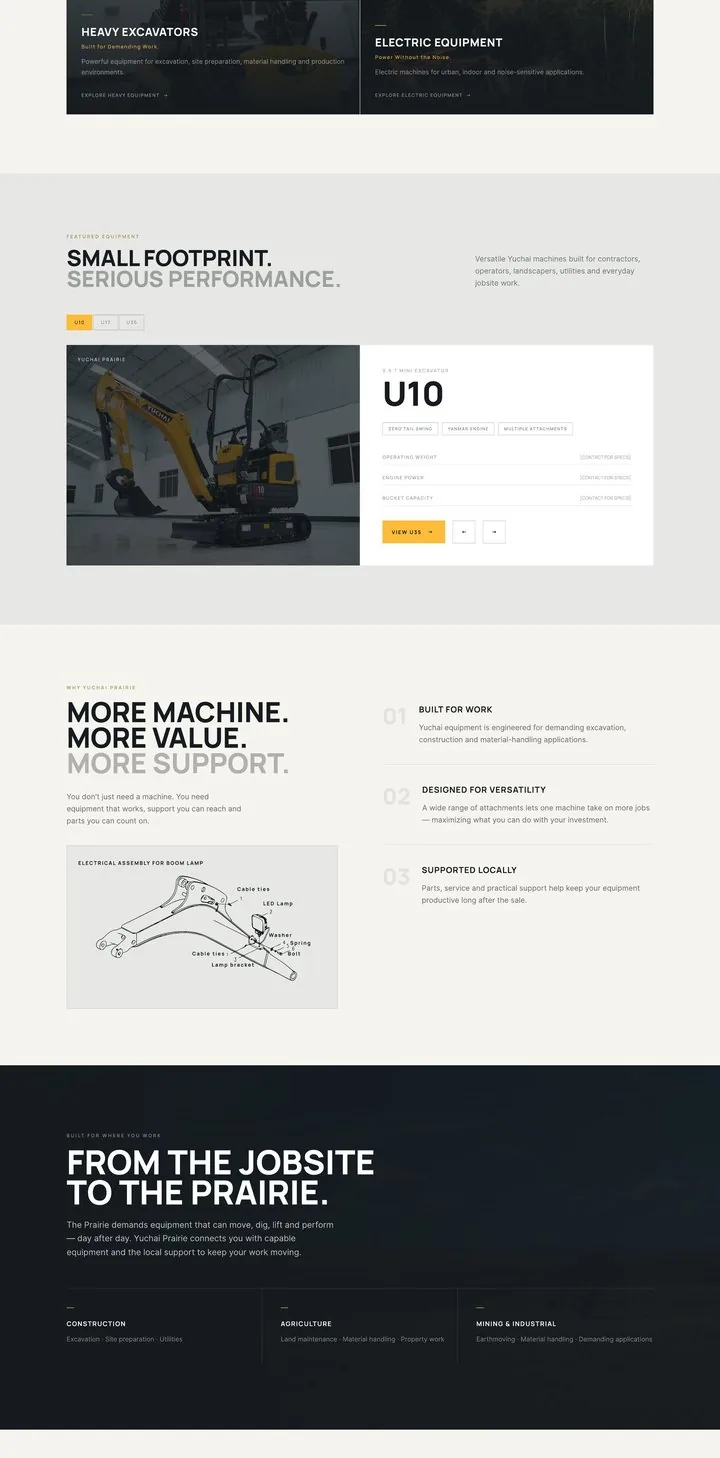
The homepage answers three questions: what does Yuchai Prairie sell, why should I trust this dealer, and what should I do next. Key screens at 1440 px, with the line drawings playing in their real positions.
Positioning, a one-line promise of local support and two routes. The U17 draws itself next to the headline.
Live animation
Yuchai equipment for excavation, construction, agriculture and demanding job sites, backed by local parts, service and support.
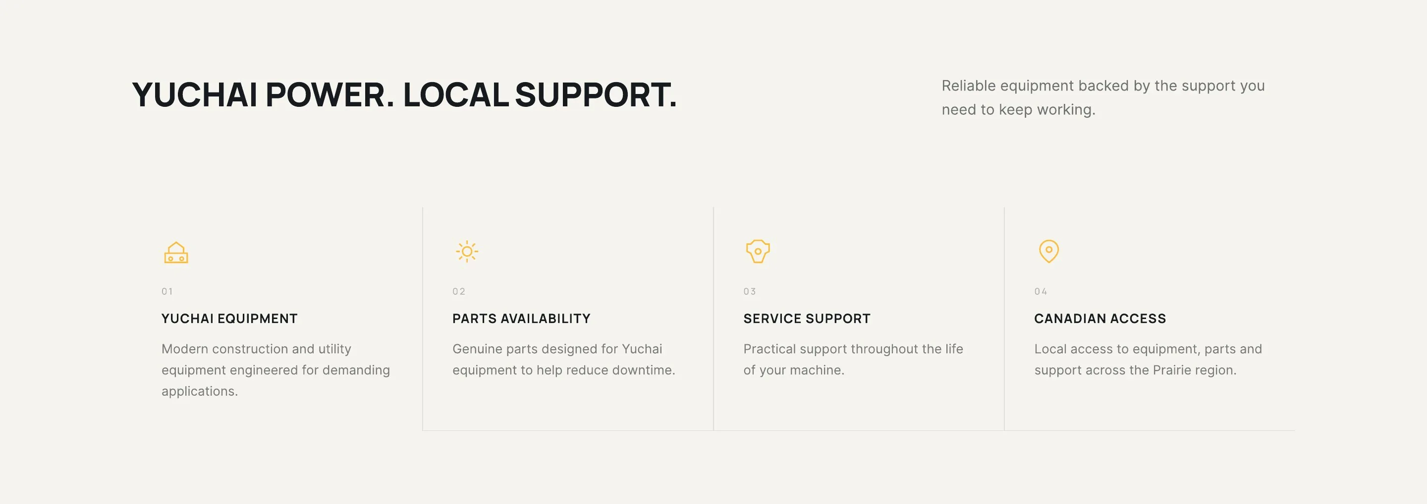
Four promises right under the hero: equipment, parts availability, service support and Canadian access.
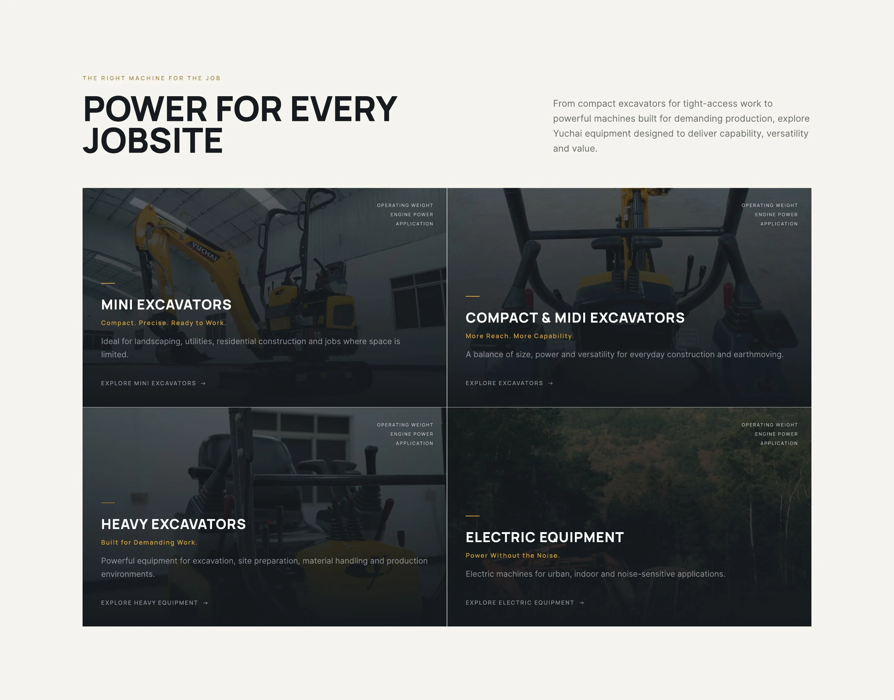
Four classes by operating weight: mini, compact and midi, heavy, electric. Each card names its use cases.
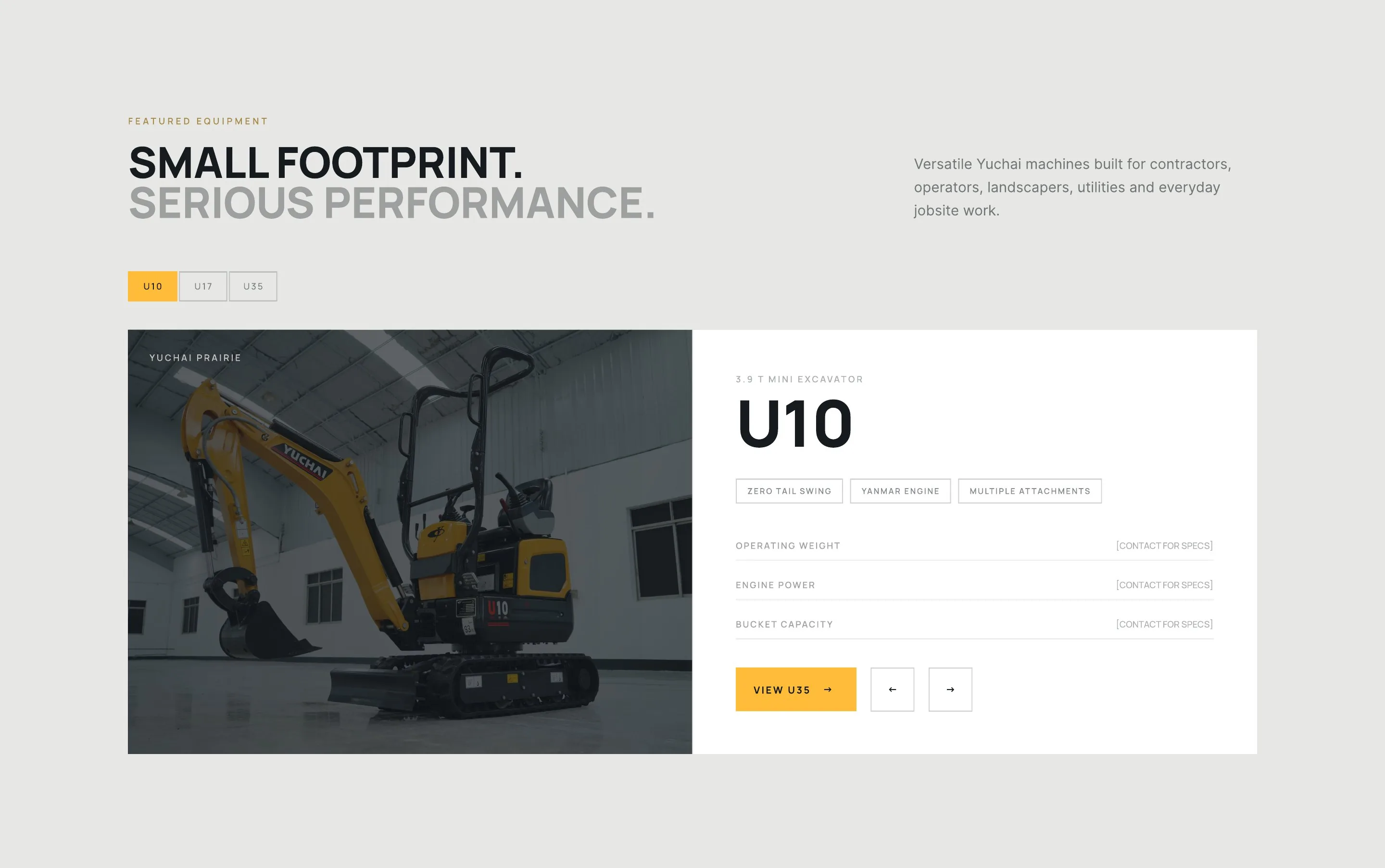
Model tabs, photo and key specs side by side. Missing data is marked "contact for specs" rather than hidden.
Three reasons to choose the dealer, next to an assembly drawing that draws itself as the section enters the screen.
Live animation
Why Yuchai Prairie
You don't just need a machine. You need equipment that works, support you can reach and parts you can count on.
Yuchai equipment is engineered for demanding excavation, construction and material-handling applications.
A wide range of attachments lets one machine take on more jobs, maximizing what you can do with your investment.
Parts, service and practical support help keep your equipment productive long after the sale.
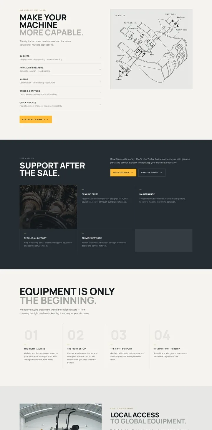
Five attachment families with use cases. The exploded bucket assembles next to the list.
Live animation
One machine. Many jobs.
The right attachment can turn one machine into a solution for multiple applications.
Digging · trenching · grading · material handling
Concrete · asphalt · rock breaking
Construction · landscaping · agriculture
Land clearing · sorting · material handling
Fast attachment changes · improved versatility
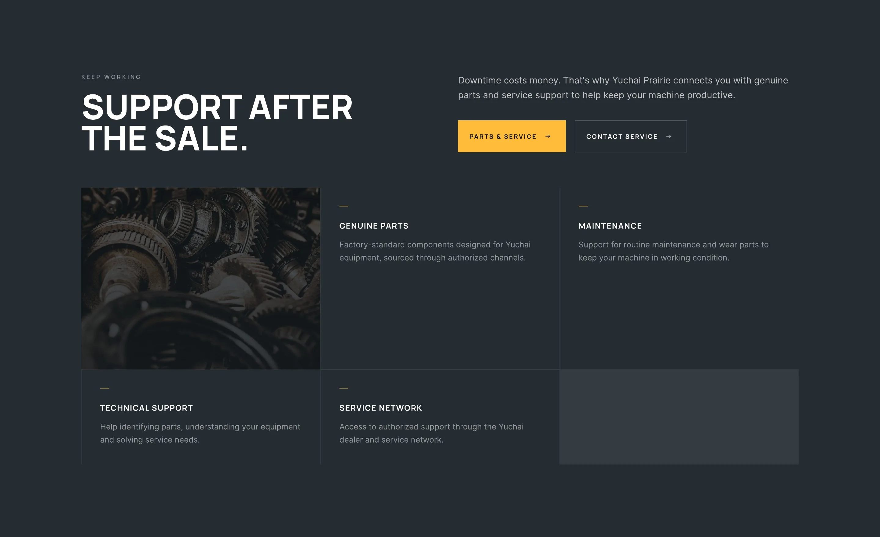
Parts, maintenance, technical support and the service network, with two direct actions. This section answers the Validate-stage doubt.
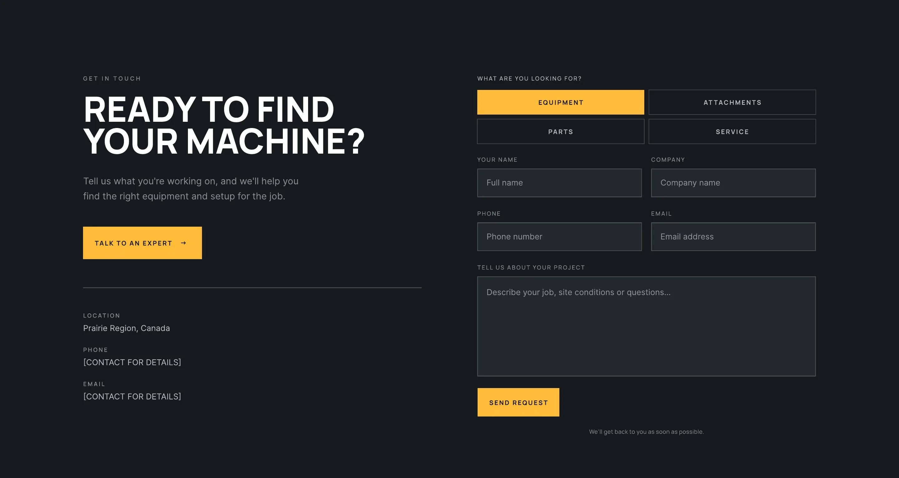
Intent chips route the request before a single word is typed. Five fields, one button, a promise to reply.
17 / Page system
The homepage sells the dealer; model pages sell the machines. Every page shares one grid, type scale and component set, so each new machine, category or service page is built from the same parts.
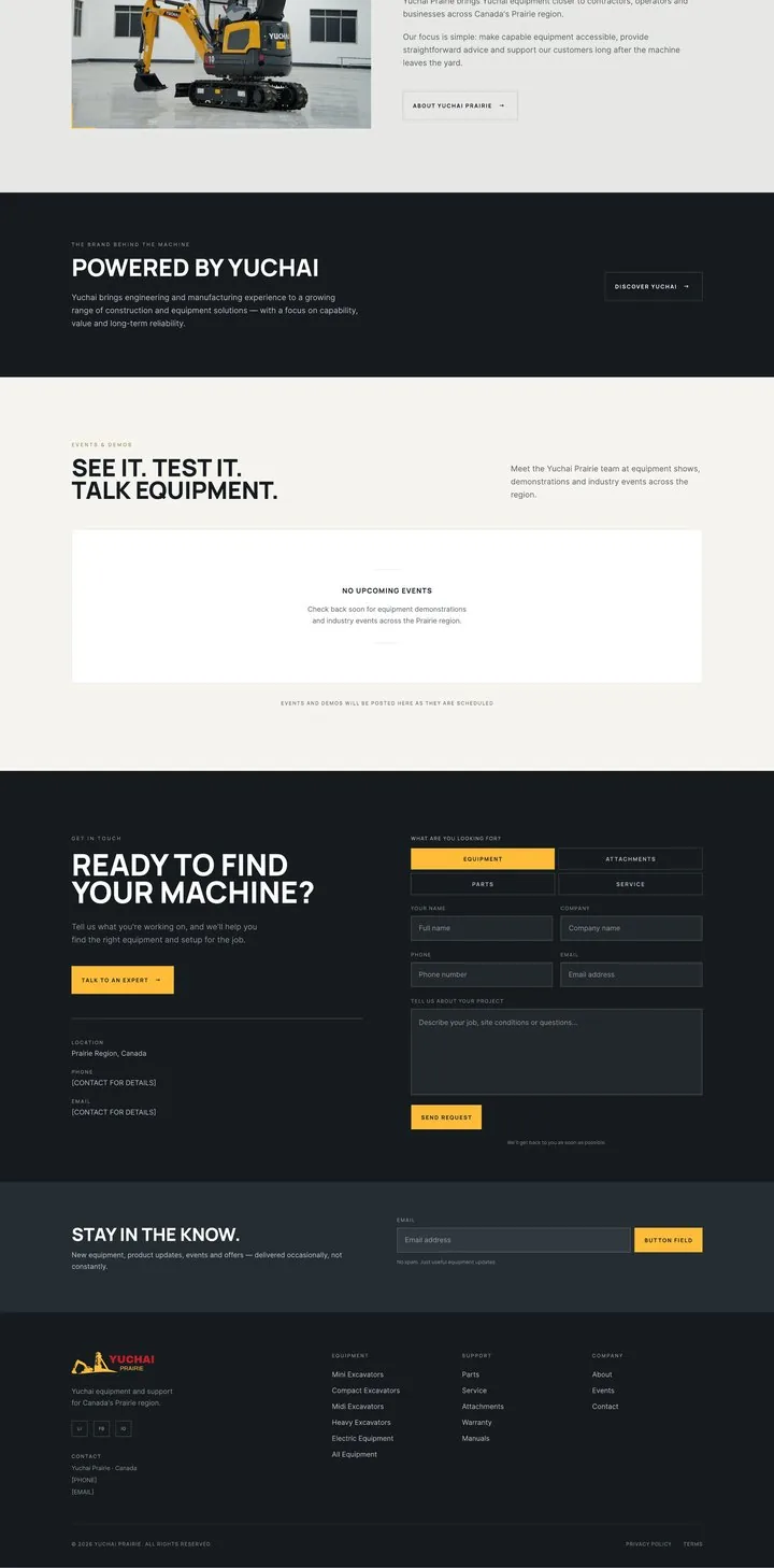
Homepage · 16 sections
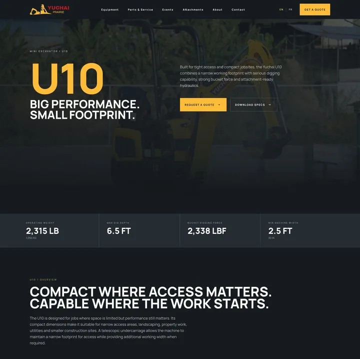
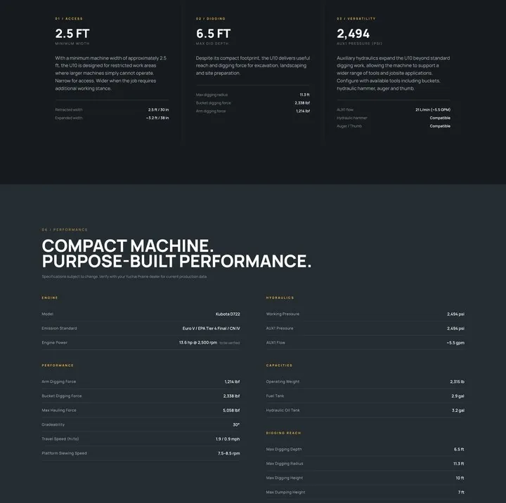
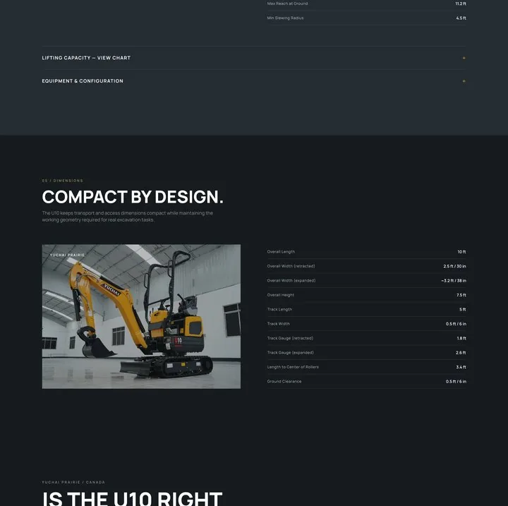
Model page · U10
18 / Product detail
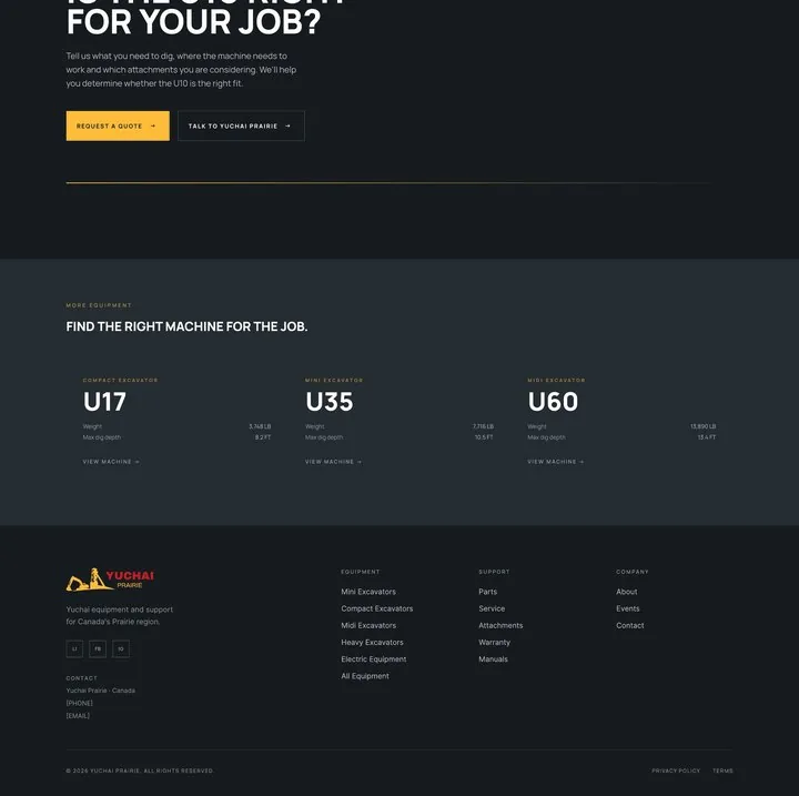
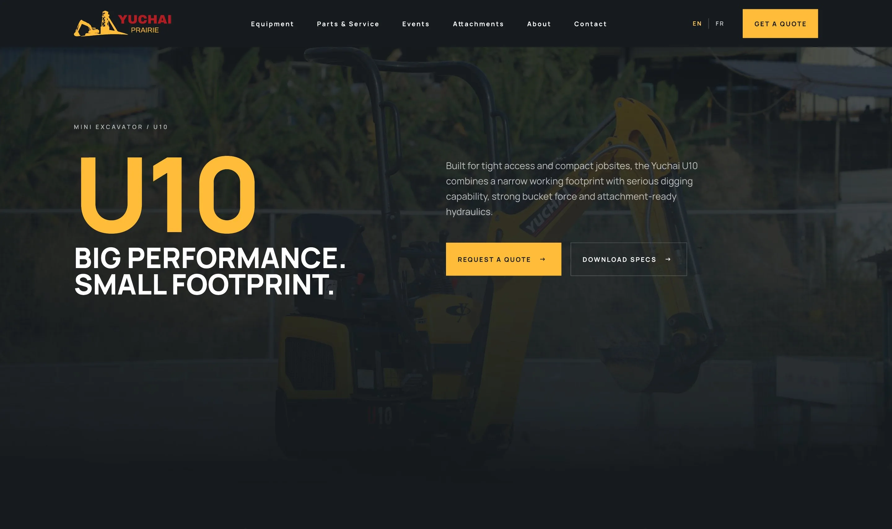
The U10 page doesn't open with a spec table. Four parameters give instant orientation: 2,315 lb operating weight, 6.5 ft dig depth, 2,338 lbf bucket force, 2.5 ft minimum width. Then raw specs are reframed around three buyer questions: access, digging, versatility.
 123
U10 in yellow at display size. The category path above it shows where the buyer is.
Request a quote is primary. Download specs serves buyers who need a document for their partner or bank.
Operating weight, max dig depth, bucket force, min. width. Weight shows pounds and kilograms together.
 4
Three columns match the three buyer checks: does it fit, can it dig, what can it run. Each has a headline number and supporting rows.
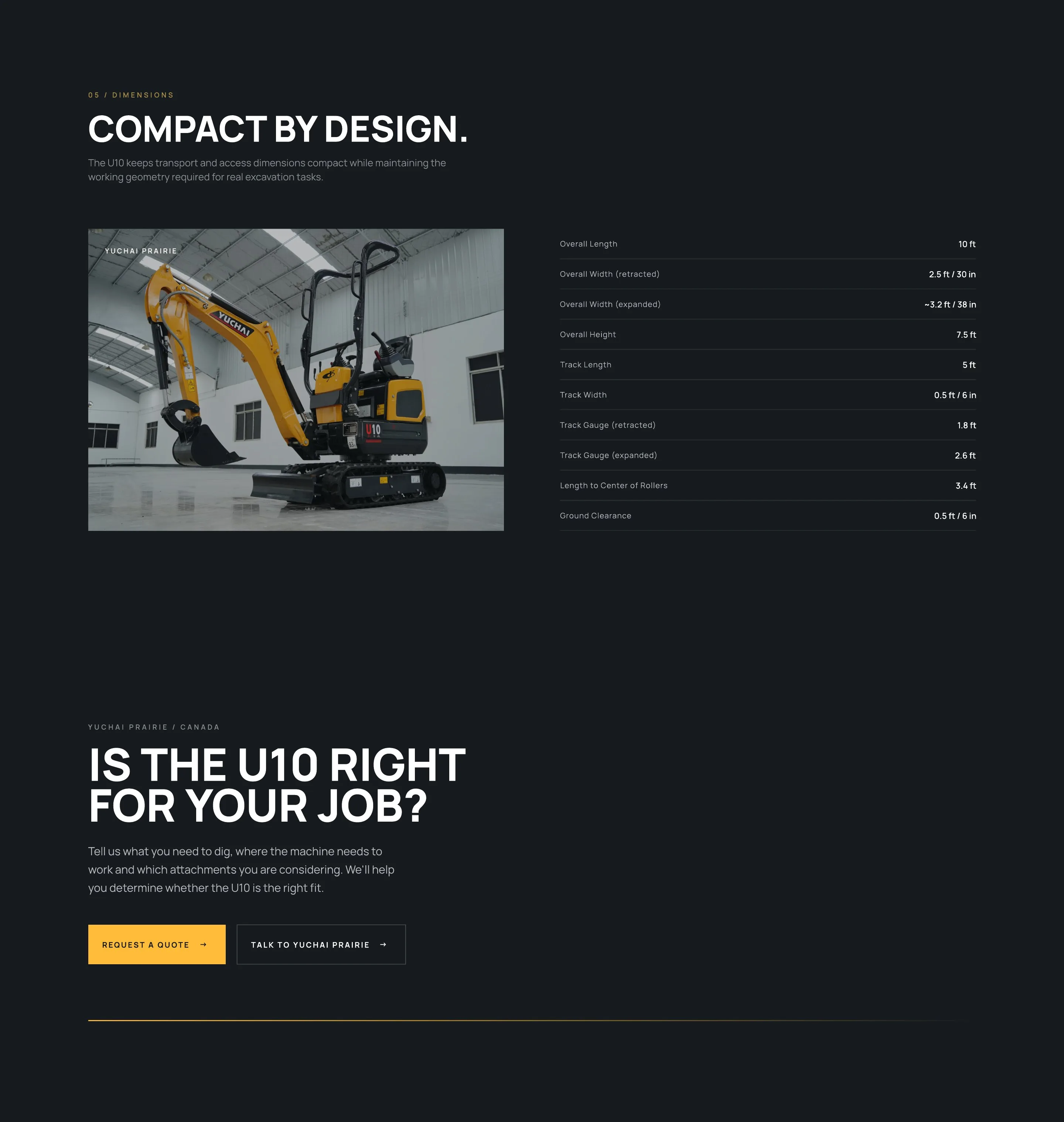
Retracted and expanded widths are shown together, so the telescopic undercarriage makes sense without a diagram.
 6789
Technical data without overload
Technical buyers still need the full data. Instead of removing complexity, it moves to the right stage of the journey, grouped by mental model: engine, hydraulics, performance, capacities, digging reach.
The machine is sold in Canada, so the UI handles both measurement systems without duplicating the interface.
Unconfirmed values carry a "to be verified" flag and a dealer note. Trust grows when the page admits what is pending.
Front and side capacities by radius, in an accordion. Planners get the detail, everyone else keeps a short page.
Frame, working device, undercarriage, hydraulics, lighting. Options are grouped the way a dealer quotes them.
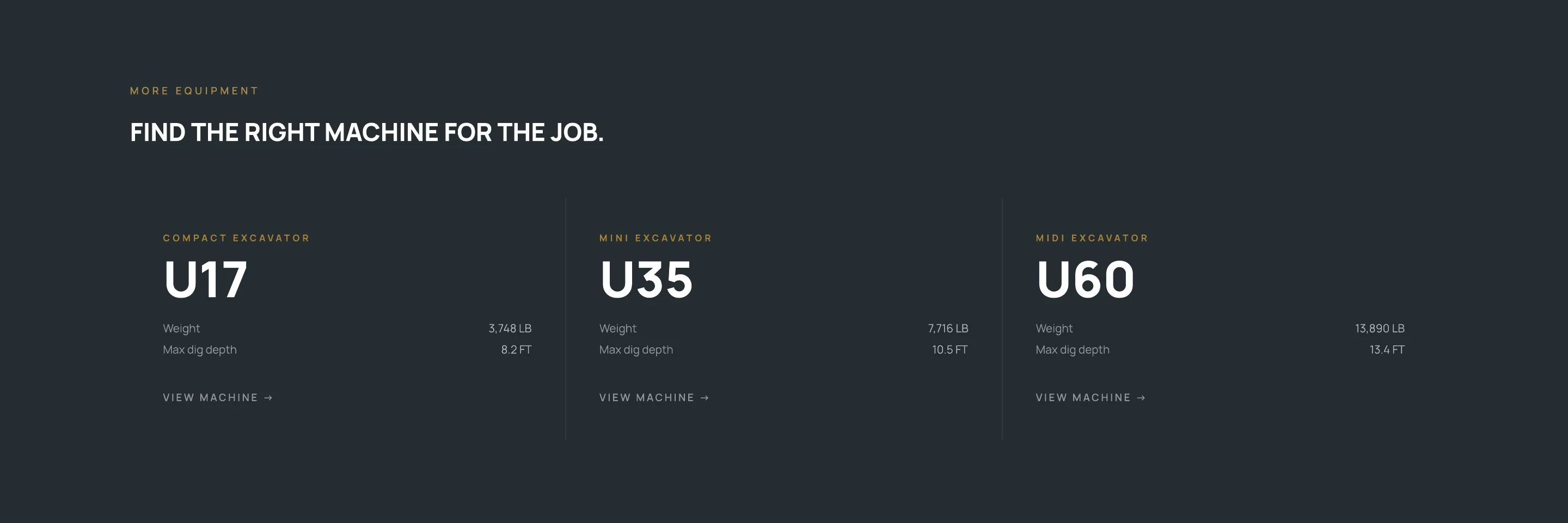
Photo and dimensions side by side, then a direct question: is the U10 right for your job? Related models keep buyers in the catalogue if it isn't.
19 / Outcome
A clear path from discovery to technical evaluation, a usable hierarchy for complex specifications, attachments and aftercare tied into the buying journey, and an engineering-inspired identity that scales to every new machine page.
Equipment categories, from mini excavators to electric machines
Homepage sections, each tied to a stage of the journey
Sequenced vector paths across three line drawings
Languages, English and French, from one content model
20 / Reflection
Technical complexity shouldn't be removed. It should be sequenced.
A contractor and an engineer may eventually need the same specification, but they don't need every specification at the same moment.
The strongest decisions in this project were about when information appears, not only how it looks.